Gaze Into The Crystal

I don’t have a crystal ball. I don’t know what is in the future. But the world out there is looking a little bit scary. I open up my computer and am bombarded with news of a world gone crazy—politics, gun violence, climate issues, terrorism, race, greed, corruption and more. My Facebook feed will give me nice things to look at, even beyond cute kitten videos and baby’s first steps, but I still have to wade through the muck of frightening stories. The internet is a hard place to find peace.

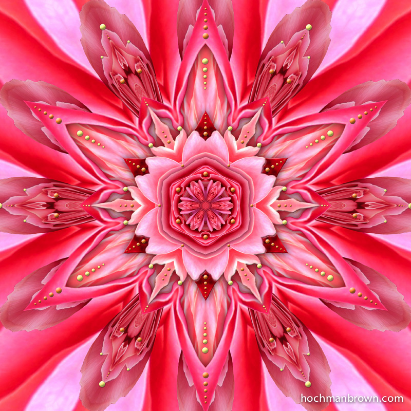
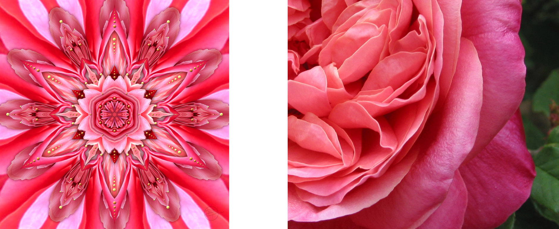
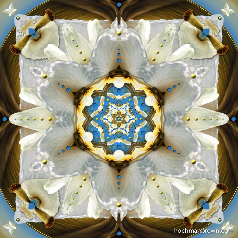
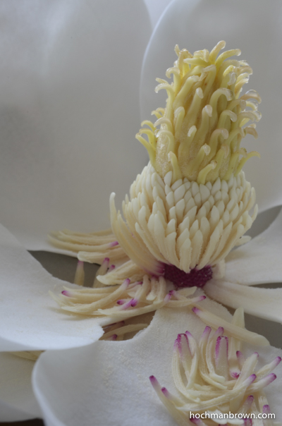
Animation showing the base image and layers of Magnolia Focus

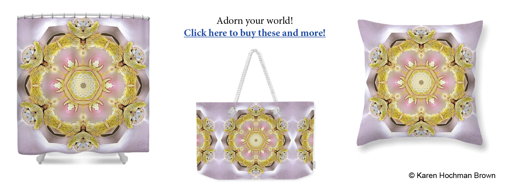
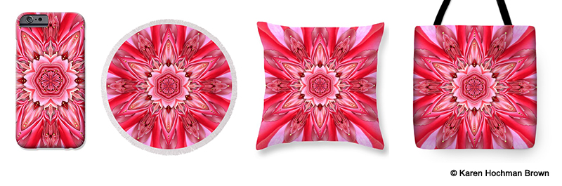
I create art on my computer. Each of my pieces represents hours spent in competition with Tweets and updates and news. My calendar reminds me to make blog posts (like this one). Banners flash across my screen letting me know I have a new communication. The whole world screams for my attention.

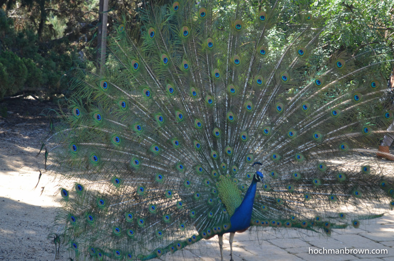
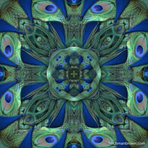
It takes steely self-control to actually make my art. But once I begin, once I have really dived into the crystal display, magic happens. The lights blinking for my attention melt away. I find total focus. Hours go by without me even thinking once about the latest poll numbers. Amid the noisy outside world, I am able to channel inner calm and create with abandon. I am transported into a state of total focus, of joyous celebration in the act of creating.

So now, you are reading this on your device desktop. I am begging to be the distraction in a small slice of your day. The irony is not lost on me. But it is my dearest hope that you find my artwork and animations more peaceful than the news and more relevant than puppies in flower pots.

Magnolia Focus_merch

Connect with Karen Hochman Brown

* indicates required


Naming A Piece

In the Court of the Crimson Queen

When I go to a gallery or museum, I first scan the piece for its visual impact. I might look at composition and color or acknowledge the artist’s cleverness. I then go in close to look at the details and technique. And before I take a step back to review and enjoy the art, I will glance at the title. This can give me an additional glimpse into the artist’s thoughts and expand my understanding of the work. In some cases, the title is the only thing remaining in an artwork, as in Lawrence Weiner’s 1969 conceptual piece A wall pitted by a single air rifle shot.

In The Court Of The Crimson Queen art & base

I find that naming art draws upon my creativity just as much as making it. I want to give my viewers a hint to what they are looking at. In most cases, I will use the botanical or common name of the plant that is my subject matter. But rather than leaving it at an identification, I try to spice it up with a bit of wit. This piece could have easily been titled Pink Rose No. 1; that would help people look for things like rose petals and structure. But using the title In the Court of the Crimson Queen adds even another dimension.

King and the Color Crimson

The title of this artwork is taken from the seminal Progressive Rock number “In the Court of the Crimson King” (King Crimson)—with a gender change. The piece was not created with that in mind. While working with this rose image, I found shapes that reminded me of very feminine slippers and of a fierce guard, maybe from the palace. Without the yellow dot embellishment, this piece is almost monochromatic in the red and pink area. I’m thinking that the word “red” isn’t very feminine or fierce. A quick trip to the Thesaurus gives me “Crimson.” The regal slippers and royal guard say “Queen.” A quick flash to my rock-n-roll past gets me to my very clever title!

Crimson Queen merchandise
Add some color to your life! Click on an image to see what’s in my store.

A More Literal Translation

TheForecastIsFern_base
Base image for The Forecast Is Fern

The photograph shown here was taken in the spectacular gardens of the Spalding House, which is part of the Honolulu Museum of Art. Unlike the lush surrounding gardens, this scene is a moss covered branch with some rather ordinary ferns. They are part of some plantings at the base of a building, not really exotic at all, at least not in comparison with the rest of the grounds. The composition of the photo is not spectacular either. But I liked the crisp focus of the fern and thought it was worth playing around with it in my workspace.

The Forecast Is Fern

In much of my work, the subject matter is not always readily apparent. Not so in this piece. Rather than blending and bending the base image beyond recognition, I chose to keep the structure of the fern’s leaves as the highlight the piece. I wanted a feeling of dense tropical jungle created by the fingered leaves of the plant. The central motifs are more typical of the majority of my kaleidoscopes. The base is detectable, but more obscured by various manipulations. But as you move outward, the structure of the fern is readily apparent and at the border, the piece is very literal. As a balance, I warped the center into a heavily distorted glass bubble, a crystal ball if you will. Look in to the sphere to see if there is fern in your forecast.


Matilija Inspiration

MatilijaPrairieInstallation_baseThe matilija poppy is a sun-loving native of Southern California. It’s large crepe paper blossom with a showy yellow puffball of stamens in its center give it the nickname of “fried egg plant.” The photograph that inspired “Matilija Prairie Installation” presents the delicate flower and furry seed pod against a brilliant blue sky.

MatilahaPoppywithSky800webI never go into my work with specific intentions. Each component is created on the fly, based on what I feel is needed for the current artwork. I find a photograph I love and then work within my process to find the pieces to assemble. This means taking the photograph into a software environment (U&I Software’s ArtMatic Designer) that I use to make the various reflections. I don’t know what the results will be when I begin to explore the parameters of the reflections. I find faces and insects; there might be seductive openings. I keep changing setting, looking more images that please me.

In this piece, I found an intriguing structure created by reflecting the seed pod. I thought it looked like the turn-key in an old windup toy or maybe nautical cleats. The white square structure felt like a stretched canvas, slightly bowed in at the edges, now held down by these cleats. Also holding down the canvas is the bottom layer that breaches the bounds of the white layer on top. The petal layers have a celebratory air, particularly when festooned with dots. They almost seem to jump of the surface. In the heart of the piece, the blue sky is used to balance with color and dimension.

Check out this image on my online store!

Shake Your Tail Feathers

Pumped-Up Peacock_base2
Peacock at the LA Arboretum

My term as Artist-In-Residence at the Los Angeles County Arboretum was during prime peafowl mating season. When I hung the show, the males had yet to grow in their signature tail feathers. They still had their striking blue neck and head feathers to easily distinguish themselves from the less flamboyant females–but the trains were yet to come.

By the time I began creating art onsite at the Arboretum, the transformation occurred; mating season had begun. And so had the unrelenting mating call, reminiscent of a small child in distress. Of course, the highlight of the ritual is the display of the colorful tail feathers, spread out like so many iridescent eyes. I began to notice hearing a rattling sound when a female was around. It seems the peacock is able to vibrate his train in such a way that the long hair-like feathers attached to the main quill flutter while the eyes stay pretty much in place. This must be very attractive and mesmerizing for the peahen. It was for me!

Pumped-Up Peacock

Quite fittingly for the surroundings, the subject of my first piece at the Arboretum was “Pumped-up Peacock,” a celebration of very showy fertility.

Here’s an interesting article about peacock “train rattling.”


http://www.arboretum.org/library-spotlight-peacocks-at-the-arboretum/

Check out this image on my online store!

Where did it all begin? Part 2 – My first piece in the series

I was working on Judaic Art but had hit a roadblock. I wanted to have my designs custom printed on silk to make into prayer shawls (tallit). The results were beautiful, but the cost was too high to make them profitable. I was frustrated and needed another artistic outlet.

In January of 2011, I attended an inspirational seminar, Matrix Energetics. And while I did not become a practitioner like my brother, it did lead me to begin my series of photography-based kaleidoscopic artwork. When I got home, I created the first piece, Magnolia Pod-me Hum. The base image is a magnolia pod from a tree in my garden. It was placed there by my landscape designer as his gift to me and as a reminder of his business, Mother Magnolia.

magnolia-pod-masked_400wm
Base image for Magnolia Pod-me Hum

I was looking though the various experimentations I had done with U&I Software’s Artmatic, a modular graphics synthesizer that I enjoyed fiddling with. I found an example I made from a piece of beach rock marked with holes. It was a simple reflection without any further manipulation. But it gave me the spark to play around with the idea of incorporating photographs into the six-pointed stars I had been creating in Artmatic and manipulating in Photoshop.

Holey Beach Rock
Holey Beach Rock

An idea was born. I used the Artmatic parameter tree (see blog post, Where did it all begin? Part 1) from Holey Beach Rock as my starter point. I made many variations on the theme with the photograph of my magnolia pod as the source. I took the resulting renders and imported them into Photoshop to be masked, shaded and layered. I decided the result needed a little something extra so I put in little versions of the magnolia pod and some dots. I can’t remember why I decided to try dots, but they seemed to work and added an extra something. The result was Magnolia Pod-me Hum–the first of what would become a series in excess of eighty pieces and still growing.

In the beginning, I set myself up with some rules, kind of like an assignment. I alway said that I work best under assignment. This time it didn’t come from the outside. My pieces would be made from a single photograph. They would be six-sided symmetry. They would have dots. I made eleven pieces like that until I created Rose Frills In Four which is titled such because I used a four-sided symmetry. Then with twelve pieces in the series, I made my second calendar.

Next time, I’ll talk about the process a bit.


Where did it all begin? Part 1 – The Software

Many people ask me how I started this series of kaleidoscopic artworks. There is no short answer, but I’ll try to address it here. As to my background, you can read about it in my About Page. But briefly, I love kaleidoscopes, geometry and unusual plant forms. My background in graphic design got me well versed in image based software. For example, I was using Adobe Photoshop and Illustrator from their inception.

My curiosity led me to some pretty amazing programs that modify images by applying advanced mathematics to alter their original structure or to generate images from scratch. These programs go way beyond fractals. The ones I rely on most are Synthetik Studio Artist and U&I Software’s Artmatic Designer, with the latter being the one mainly used in my kaleidoscopes. I have another, completely different body of work that was created using Studio Artist, but I not going to talk about that at this time.

When I purchased Artmatic in 1999, I spent a lot of time working with fractals. The program has a randomize button that is useful when learning the software. There are hundreds of parameters (tiles) that can be strung together in different structures, or trees. There is no limit on the number of tiles that can be placed in the tree. Each tile has one to four sliders that can be adjusted. So using the random button and pre-designed trees are good jumping-off points.

MD-JewelTones
Magen David – Jewel Tones

It wasn’t until 2005 that I came across the small corner of the program that worked with center-based mirrors. I was working with Judaic themes at the time and I experimented a lot with six-pointed symmetry to relate to the Magen David star that has been adopted as a symbol of the faith. These artworks were created entirely inside the computer. I wasn’t yet using photographs for the source. In 2010, I had enough of these images that I decided to put together my first calendar. This means that in six years, I had created only 12 pieces like this, or enough for me to consider them a series.

It was in early 2011 that I began using my photographs to create the stars. I had already been using Photoshop to alter what Artmatic generated–cutting up several images, layering and weaving them together to make new artworks. As an example, the piece shown here, Magen David – Jewel Tones, is made from four variations of the same Artmatic tree, each with different surface decoration. When I discovered what using photographs did for my art, I ran forward with the idea and never looked back.

At the moment, my series of photographic based, kaleidoscopic artwork numbers in excess of eighty. Next, I’ll discuss the very first one.

Reflections In The Garden at the LA County Arboretum

I am very happy to announce that I am to be the inaugural artist of the newly renovated Library at the Arboretum. The interior space has been designed with the intent to show local artists whose work complements its surrounding botanical collection. I am installing my kaleidoscopic artwork in early January with the show running through the end of June.
Reflections In The Garden notice