There Be Dragons Here

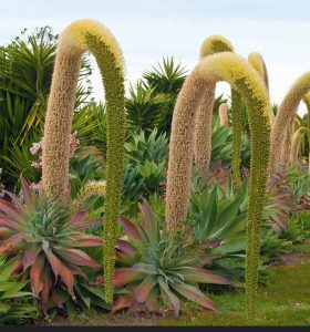
In the winter, around the solstice, we would rejoice in my mother’s front garden, as the dragons would emerge from their spiky nests. For that is what we called the giant, arching flower spikes of the agave atenuata plants that populate the frontage of the property. They became famous. Really! Buses of tourists actually stop for pictures when the dragons are in bloom.

Base image for Agave Solstice

Something I find most fascinating about the agave is that the flowers don’t produce seeds per se. Each blossom in the giant cluster turns into a baby plant, a pup.  And sometimes, a few of the pups still attached to the base of the cluster, in a premature exuberance of growth hormones, will sprout their own blossoms, creating a brood of mini-dragon.

©Susan Shalbe
©Susan Shalbe

Upon blooming, the agave plant has fulfilled it’s mission and produced hundreds of pups that may or may not take root. It’s a numbers game. The plant will whither and die, only to rise again in the form of new growth that will continue the cycle some ten to fifteen years hence. Unfortunately, the small blooming minis suffer the same fate as the mother plant.

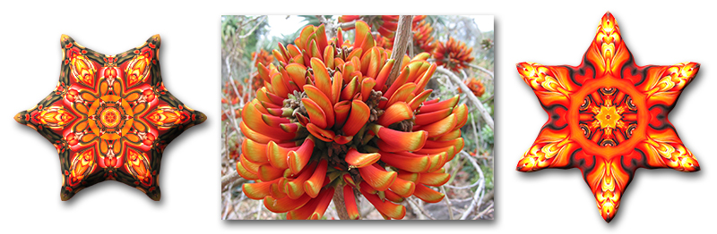
The base image for Agave Solstice is from a less explosive stage in the life of the plant.

Agave Solstice
Agave Solstice

It’s done when I say it’s done.

Over the past several months, I have been sharing animations of my work that take you through the process of constructing a piece as I build it up layer by layer. Today I am sharing a different aspect of the creative process. When is a piece done? It is easy to overwork in the quest for that moment when the artwork is finished. Working on the computer, I have the luxury (or is it a curse?) of being able to endlessly edit. I also have the ability to save stages of a piece. The animation I am presenting here goes through many stages in the creation of “Perito Moreno Glacier,” searching for that moment when it is done.

Perito Moreno Glacier_animation from Karen Hochman Brown on Vimeo.

The Perito Moreno Glacier in southern Patagonia was one of the highlights of our trip to Argentina. My husband and I take the standard package deal for most of our travels. No jeeps or helicopters, we do the pedestrian version of the tour. At Perito Moreno, that means a multi-storied catwalk that comes very close to the face of the glacier. Your base of operations is a vast tourist center/cafeteria atop an overlook to the giant glacier. And you walk down a metal path that keeps the hoards from trampling the earth and still get up close to the face.

perito-moreno-triptych
Bits and pieces from the artwork. Some used, some not.

The view is from a high vantage point. The jagged structure of the glacier surface is startling in its severity. I knew I must take many pictures of the amazing blues and patterns to use in a kaleidoscope. As I began to work on the piece, I was continually stymied. My work has been mainly of organic material. The form of giant ice structures and watery blues seem unfamiliar, and monochromatic is problematic. And so I fiddle with many different iterations in search of the point when the piece is done. I believe that creating “Perito Moreno Glacier” took more time than any other work of mine. The animation shows “only” 14 of the 31 versions I recorded. I printed out drafts at an alarming rate. I gave it a rest for two weeks—twice. But in the end, it was beautiful; it was dramatic; it was done. 

Celebrate December’s Holiday Season with “Grevillea Regalia”

Share the Love

#LoveWins

I have always loved making things. As a child, I sold watercolor greeting cards and beaded jewelry in my father’s place of business. I made my own clothes. I painted and crochet and embroidered and set bezels and on and on and on. While reviewing an old diary, I see that at one point, I had wanted to be a world famous fashion designer. I did have a small stint at making playful fabric hats (Bell Hats Over The Pacific) and other children’s dress-up items, but I moved on to working completely on my computer. 

LoveWins Animation from Karen Hochman Brown on Vimeo.

And in the digital realm, there is no actual product. Yes, I can and do print on paper and aluminum substrates that can be used to dress up walls. But my earlier passion was to make garments and personal adornments. For this, I have had to wait for the technology to print designs on fabric. And it is quite an interesting world now that artwork can be translated into fashion on demand! The first manufacturer I used gave me a good looking garment, but the fabric was thin and I was worried about having a Lululemon moment. Fortunately, I have found a company that produces a fine product that I am proud to present.

Leggings and beanie design from "LoveWins."
Leggings and beanie designs based on the artwork “LoveWins.”

I decided to use my artwork “LoveWins” for my first foray into digital printing on fabric. The piece was made in support of marriage equality and I think using it for fashion is an expressive way to share the love. The leggings and beanies I started with are a fun and cool way to take my artwork off the walls and share the love with the world. You can find them and other designs I’ve been working on over on my Art of Where site here!


Synthesized painting

This summer I had the opportunity to do a finite series of 50 small artworks in 50 days. I set up parameters for the work, one aspect was that I incorporate a technique I haven’t used before in the kaleidoscope pieces.

Yellow Sunflower Animation from Karen Hochman Brown on Vimeo.

For the entire series, I designed a custom paint brush that I created in the program Studio Artist (Synthetik Software) to create the backgrounds from each of my base images. Studio Artist is a graphics synthesizer that can apply individual brushstrokes based on a photograph or image. The program looks at the contours, luminance, color and texture and then can either auto-draw or be specifically directed by the user. 

Three examples of Studio Artist brushes
Three examples of Studio Artist brushes on the same rainbow sphere base.

Watch the animation and you will see the brushstrokes being applied in Studio Artist. From the resulting “painting” of the sunflower base image, I reflected a portion around into the background. The additional layers are more similar to my kaleidoscopic work. They are reflected and distorted, but still keep the starter image intact. 

Keep Loving

Loving Day commemorates the 1967 Supreme Court decision of Loving v. Virginia, the case that legalized interracial marriage. Both the case and the holiday take their name from Richard and Mildred Loving, a couple that grew up and fell in love in Virginia. Although Loving v. Virginia was decided in 1967, the most reluctant southern states took until the year 2000 to repeal their miscegenation laws. This became pertinent in my life when our family became inter-racial when my son and his wife were married on Loving Day. The basis for this artwork is my beautiful daughter-in-law’s wedding bouquet.

Subscribe to my mailing list

* indicates required


Warrior In Paradise

The base image used to create Bird O'Paradise by Karen Hochman Brown.

I meditate on Bird OParadise when I am in need of powerful inspiration. There is nothing shy about this piece. The structure and boldness of the Bird of Paradise flower is apparent in the artwork.

Bird O’Paradise from Karen Hochman Brown on Vimeo.

The dominant motif is the vibrant orange square. Its double fortified walls are suspended from a blue perimeter above a featureless green field. Inside another blue boundary is a dynamic sun. The orb’s horned aggression is held in check, trapped inside crystal.

Base image (center) and two "foundlings" for "Bird O'Paradise

Base image (center) and two “foundlings” for “Bird O’Paradise.”

When creating this piece, I struggled with the warrior forms that were advancing. The orange is fierce and somewhat aggressive. It is from the “head” part of the bloom. The edges are hard and there are dangerously sharp points. But nature has balance. The flower itself provided relief from the forceful orange with its indigo petals that happen to be fused into the shape of a heart.

Blue is the complementary color of orange. They reside across each other in the color wheel. Nothing that is in orange is in blue and vice versa. Mix them together and you get mud. Keep them separate and they create tension. The hot orange does not overpower the cool blue, nor does the blue subdue the orange.

bird-oparadise_merch

Subscribe to my mailing list

* indicates required


The Repose of Autumn

My husband and I are members of a Community Theater company and we have been rehearsing feverishly to put on our first drama, Twelve Angry Jurors. We opened this weekend and close the next. I play the role of the Foreman. It is my job to keep the jury room in order, to take and tally votes and, so it would seem, tell a lot of people to calm down and sit down, including my husband. The opening went well. Whew! When we got home from the performances we sat down to watch the Second Presidential Debate. I am hit with how relevant the highly charged characters in this 1950s play reflect what I see on my TV today.

LateAutumnLeaves_animation from Karen Hochman Brown on Vimeo.

More than being a courtroom drama, this play shows us the dynamics of a small group of individuals and how they come to be of a like mind. In this drama, and hopefully in real life, those who speak their mind in the name of truth do influence the way others act. Poisonous diatribe is stopped while sane and rational discourse has a chance to triumph.

late-autumn-leaves_triptych
Base image (center) and two “foundling” images for “Late Autumn Leaves.”

I chose Late Autumn Leaves to share this week because I just need to calm down after opening night jitters and the social politics of 2016. This work reminds me the days are getting longer and time is slowing down as we head into Fall. Green leaves are turning color. The sky is bright blue and can be seen peeking through arched cathedral windows near the center of the piece.

late-autumn-leaves_merch


Finding Focus in the Calm Places

It was January of 2011 and I was struggling with where I wanted to take my art and my art career. I had been making Judaic artwork using some powerful graphic synthesizer programs. The goal was to print images to silk to make prayer shawls. The technology was new and expensive, and over the course of a year and a half, I found the whole process too frustrating to continue.


So now I find myself lost and unfocused. I am at the end of that journey. I’m out of a job, a job that I invented. I feel betrayed by the very thing that feeds my soul and gives me great comfort. For many months, I tinkered with various software programs looking for something new to do. I revisited prior projects to see if new insight would advance them to the front.


Base image (center) and two "foundlings" for "Erythrina On Fire."
Base image (center) and two “foundlings” for “Erythrina On Fire.”

One day, I made the inspirational leap to use photographs with the math-based software that landed me in a place where I was able to regain my focus. So much so, that I have been concentrating on this series for almost six years, creating more than one hundred, forty pieces.

In the artwork Erythrina On Fire, I have constructed a large swath of smooth cream color against the very busy orange structure of the reflected flower. You can see in the animation of the piece how I altered the colors to give the viewer a place to rest comfortably in a calm place amid the surrounding chaos.


erythrina-on-fire_merch